

Appearance
Text and fonts
On this page you will write text in drones, choose a font, and set how many drones spell it.
Text is drawn by placing drones along letter strokes. The app places exactly the number of drones you ask for and keeps the corners of letters sharp.
Add text
- Open the Add menu and choose Text.
- In the Properties panel, type your words in Content.
- Choose a Font.
- Set Font size (m) and Drones.
- Raise it with Translate Z. Like other shapes, it starts at the show origin.
- Drag it into a Formation group so drones can fly to it.
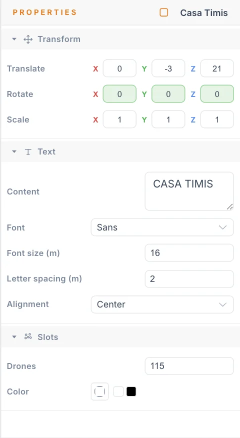
Settings
| Setting | What it does | Default | Good starting value |
|---|---|---|---|
| Content | The words to write. | TEXT | Keep it short. Fewer letters read better. |
| Font | The font face. See Font faces. | Sans | Sans is the clearest for short words. |
| Font size (m) | Height of a capital letter. Minimum 0.1. | 10 | Increase until Min slot distance is above your separation limit. |
| Letter spacing (m) | Extra gap between letters. Negative values are allowed. | 0 | 0 |
| Alignment | Anchors the text at its origin: Left, Center or Right. | Center | Center |
| Drones | The exact number of slots, from 4 to 2000. | 120 | See the tip below. |
| Color | Base colour. Black means the LED is off until a colour clip lights it. | Black | Leave it. Use colour clips. |
Text is always one line. A line break in Content acts like a space. For two lines, add two Text elements and put them in one group.
How many drones
Too few drones and letters break apart. Too many and drones crowd together. After you set the size, select the Formation group and read Min slot distance. It should stay above the Min separation (m) on your Launch Pad. If it does not, make the text bigger or lower Drones.
Font faces
The Font list has eight faces. Most are drawn as a single stroke, like handwriting with a pen.
| Font | Look | Letter case | Romanian letters |
|---|---|---|---|
| Sans | Clean capitals. | Capitals only. Lowercase turns into capitals. | Capitals: Ă Â Î Ș Ț |
| Script | Slanted script with joined letters. | Upper and lower | Lowercase: ă â î ș ț |
| Hand | Handwriting. | Upper and lower | Partial: ă â î Ă Â Î |
| Nothing You Could Do (centerline) | Loose handwriting. | Upper and lower | Partial |
| Italiana (centerline) | Thin, elegant display letters. | Upper and lower | Partial: â î Â Î |
| Crimson Pro Italic (centerline) | Italic book style. | Upper and lower | Full |
| Poiret One (centerline) | Geometric display letters. | Upper and lower | Most: no ț or Ț |
| Black | Heavy letters, drawn by their outlines. | Upper and lower | Full |
All faces include A to Z, 0 to 9 and common punctuation. If a face has no shape for a character, the character leaves a gap. Check accented words after you switch fonts. Sans is the only face with Cyrillic, and it covers only 11 capitals, so check Cyrillic text carefully.
Black draws the edges of each letter, so it needs more drones than a single-stroke face. At low drone counts it leaves out small inner holes in letters, because the two sides would crowd together.
In Script, letters join into one line within a word. A large Letter spacing (m) can break the joins.
Split a word into letters
To animate each letter on its own:
- Right-click the Text element in the Hierarchy.
- Choose Split into characters.
Each character becomes its own Text element in the same place, and the drones are divided by stroke length. The original is hidden, not deleted. Show it again and delete the letters if you change your mind.
This item appears only when the text has at least two characters besides spaces.
Tips
- Thin display faces need good contrast with the sky and enough drones per stroke. Try them at your real fleet size.
- To fine-tune a letter that reads badly, convert it to a point cloud and move those drones by hand.
- For reveals across a word, use a colour effect on the group.
Next
Draw your own lines with Splines.